

Alex Toth may be an acquired taste for some of the newer comics readers. Steeped in the "old school" of comics and cartooning, he was a firm supporter of drawing from life.

I just have to comment here on the "splash" panel. Look at the building in the upper left background, notice how he uses just black and white to delineate it. No wasted details.

Panels 3,4,5,6: Laid out just like a Hollywood storyboard. Camera zooms in and out naturally and doesn't detract/distract from the dialogue.

Fight scene with no wasted panels; a lesser artist would stretch this out for several pages thinking that more details make a better impact.

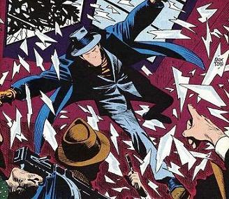
I'm not so pleased with the "breaking glass" effect, but it doesn't seem to affect the overall story flow.

Once again applying the "less is more" principle. If this were a modern comic, the artists would rely upon photoshop effects to convey a smoke-filled room.

Last panel: Even tho' the Question's trenchcoat appears to be several sizes too big, it still seems to work in terms of overall visual effect. Vic Sage is pissed and he's not going to take it lying down. The oversized coat seems to make him appear larger and more formiddable.

This whole layout just makes me wonder why anyone uses more than six panels per page.

So, there you have it. Alex Toth at the top of his game. Am I the only one who thinks that this is freakin' awesome?
from CHARLTON BULLSEYE #5, July 1976
reprinted in
ACTION HEROES ARCHIVE #2
*
No comments:
Post a Comment